 |
| Click image to enlarge. |

Saturday, March 30, 2013
Seeds of Wisdom
This one is for the Seeds challenge at Inspiration Avenue.
For this one I created the seeds and the sprouts in Illustrator first. I thought about sprouting some real seeds, but I didn't want to wait that long. The moon is a brush that I created. The cloud is from a photo. The statue is from a very old photo of a statue in an art museum. The yellow flowers were growing in my garden.
Wednesday, March 27, 2013
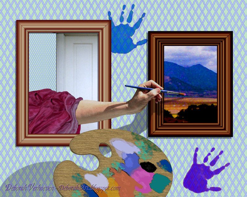
Painterly
This is for the Out of Bounds challenge at Three Muses.
The frames were created in Photoshop. The painting on the right is an old photo that I applied artistic filters too. The wallpaper was created in Adobe Illustrator. I also created the palette in Illustrator and finished it up in Photoshop.
 |
| Click image to enlarge. |
Monday, March 25, 2013
It Looks Like Rain
This is for the Umbrella challenge at Take a Word.
I took my black umbrella outside to photograph it, but between the crazy wind and the fact that it was partially broken anyhow, I realized I had to make one from scratch. I did so in my trusty old Macromedia Freehand. I should be using Illustrator, but I'm faster in Freehand. The clouds, and scenery are from my photos. The moon is a brush I created, and the rain drops are recycled from a photo I took of a clear marble. Yes, that's my dainty little hand.
 |
| Click image to enlarge. |
Sunday, March 24, 2013

Saturday, March 23, 2013
Making Mountains
Last summer I created a piece called Paper Mountains Majesty. I thought the making of this one might be fun to share.
I love mountains, but I live in Florida. I have a few pictures of mountains from my travels, but I only have so many and often I can't find just the right one. So, with that in mind, I began to play and to explore ways to make mountains in Photoshop. The idea hit me that if I crumpled pieces of tissue paper, I could make craggy mountains and color them any way I wanted. I realized that it didn't even matter what color the paper was, because in Photoshop, we have full control of colors and how bright or dull or dark we make them.
I took several pictures of the tissue paper mountains. Below are but a few. It was windy that day. If you look carefully, you can see where I had to set down objects to keep it from blowing away.
The other items I included were a flat sheet of crumpled paper for the foreground, a photo of some clouds, and some nice juicy strawberries. Note that I set the strawberries on white paper towels so I could trim them easily later.
The trees on the mountains were all created from a brush that I made from a photo of a pine tree. I dotted them throughout the mountains and varied the sizes. One of my favorite keyboard shortcuts for the brush (and also the eraser) is the use of the two bracket keys to toggle it bigger and smaller.
I added little shadows by all the trees to give them depth.
I wound up with numerous layers for this--more than I am showing below. The snowcaps of the mountains are copies that I bleached out and then trimmed.
It all sounds like a lot of work, but when you are on a creative roll, you hardly notice.
 |
| Click image to enlarge. |
I took several pictures of the tissue paper mountains. Below are but a few. It was windy that day. If you look carefully, you can see where I had to set down objects to keep it from blowing away.
 |
| Click image to enlarge. |
The trees on the mountains were all created from a brush that I made from a photo of a pine tree. I dotted them throughout the mountains and varied the sizes. One of my favorite keyboard shortcuts for the brush (and also the eraser) is the use of the two bracket keys to toggle it bigger and smaller.
 |
| Click image to enlarge. |
I wound up with numerous layers for this--more than I am showing below. The snowcaps of the mountains are copies that I bleached out and then trimmed.
 |
| Click image to enlarge. |
Tuesday, March 19, 2013
Up, Up and Away
This is for the Balloons challenge at Three Muses. I'm a little early, but I thought it would take longer to create this piece.
It all flowed from the squirrel and the balloon. I really wanted a mouse, but I didn't have a picture of a mouse, or a mouse to pose for me. I have a picture of a rat (we had a rat problem in the neighborhood for a while), but a rat would have taken everything in a different direction.
I created the balloons in Adobe Illustrator. The wallpaper, clock, and mirror were also created in Illustrator. The curtains were created in Photoshop using gradients. The rest was patched together from photos, including the squirrel, who was kind enough to pose on the bird feeder. The tabby is my cat Nigel.
 |
| Click image to enlarge. |
I created the balloons in Adobe Illustrator. The wallpaper, clock, and mirror were also created in Illustrator. The curtains were created in Photoshop using gradients. The rest was patched together from photos, including the squirrel, who was kind enough to pose on the bird feeder. The tabby is my cat Nigel.
Saturday, March 16, 2013
A Penny for Your Thoughts
I was playing today. I've developed a recent fascination for wallpaper, which in this picture I created in Adobe Illustrator and imported to Photoshop.
The mirror was created in Photoshop, when I was playing with the possibility of creating a frame from scratch. The clock is also a digital creation. The rest of the elements are from photos. I had fun with this one. I think I might do more similar pictures.
 |
| Click image to enlarge. |
Friday, March 15, 2013
Always After Me Lucky Charms...
This one is for the Green challenge at Take a Word.
The shamrocks I used are oxalis, which grows rampantly wild here. (I don't mind because it gets pretty pink flowers.) I read somewhere that shamrocks are a type of oxalis, so shamrocks they be. The hills in the background were actually photographed in Scotland. (Close enough, LOL!) I flattened the highlands a bit and pumped up the green for the Irish effect. I used four separate "shamrock" shots to make sure it didn't look like I was just duplicating the same image over and over again.
I'm still working on effective ways to make rainbows. This time I made gigantic circle in Illustrator with the whole spectrum as a radial gradient, then exported it to Photoshop and chopped it in half. I think I need to find a tutorial to see if there is an easier way.
NOTE: I've also just submitted this to Sunday Postcard Art.
 |
| Click image to enlarge. |
 |
| Click image to enlarge. |
NOTE: I've also just submitted this to Sunday Postcard Art.
Thursday, March 14, 2013
Along Came a Spider
This is for the challenge at Collage Obsession called Inspired by Fairytales and Children's Literature. I hope nursery rhymes count, as I'm sure this one has been published somewhere in a children's book.
I had some fun with this. The spider is from my garden, but the original was a bit blurry, so it became a black spider. The curds and whey were a pile of white beans that I mangled until I felt it resembled curds and whey. I created the wallpaper in Macromedia Freehand, because I still have it on my computer and I'm still better with that program than I am with Adobe Illustrator.
Yeah, I'd leave the spider to finish off my bowl. Of course, I don't like cottage cheese anyhow.
Update:
I found a few flaws in the above picture that I couldn't live with, even though I told myself no one else will see them. I could see them! So, here it is again, corrected to my satisfaction. Can you spot the changes?
 |
| Click image to enlarge. |
Wednesday, March 13, 2013
Juggling Wineglasses
I thought I would share another how-did-I-do-that with you.

Last summer I created a picture I called Happy Hour. I had just done another piece called Blue Plate Special, and I was still in the mood for blue. I thought it might be fun to have a pair of hands juggling wine glasses.
When I'm taking pictures for a new idea, I take a lot of photos. I don't have a fancy photo studio, and the best lighting I've found at my place is the outside deck. I took several pictures of the blue goblet. Below are just a few.

I found the best way to take its picture was to hold it up in the air with the sky as the background. This makes it easier to remove the background by having less clutter behind it. I tilted it at different angles because I wanted it to look like there were several wineglasses, and I'm always conscious of highlights and shadows. I knew that later I would have to erase the hand from the picture.

I picked out two that I saved and cut them out, but of course there were still remnants of the fingertips. That's okay. there is nothing in Photoshop you can't cure with a little clone stamping and smudging. You do whatever it takes.
I also had other things to gather up. I have an image I created and re-use for my tile floors called checkerboard, a picture I took at the beach, and some shots I took of my hands.

The floor had to be colored (levels work the best to turn black into color), turned 45°, and then given the proper perspective. I've found just using the Perspective transformation in Photoshop gives a bit of a bowling alley effect to it, so solve this by applying the Perspective transformation, then I squash it in the Scale transformation, and keep going back and forth until it looks right.
I had to do some fixes with the water. The file was small and had to be enlarged. The Golden Rule of graphics is never to enlarge an image, but sometimes with a little trickery and some artistic filters, you can get away with it. I also had to straighten the horizon, which was curved because of the wide-angle shot.

I piled them all up in their own layers, including the shadows and highlights. I didn't do it here (because I'm lazy sometimes), but it's good practice to name each layer. I can easily accumulate up to twenty layers in one scene, and sometimes I start losing track of what they are. Note that each wineglass has its own layer, as well as each hand. That gives me more flexibility to move things about.
So, there you have it--easy as pie!
Tuesday, March 5, 2013
In A World
This is for the Children challenge at Three Muses.
I don't currently have any children around the house to pose for me, but I do have albums full of pictures of my kids. This one was taken during the eighties when we were on vacation. It wasn't taken on a beach but just outside the room at the resort we stayed at. They were both coloring and not fighting. I'd always loved it and had intended on making a watercolor painting from it, but never got around to it.
 |
| Click image to enlarge. |
Saturday, March 2, 2013
Pollen Nation
This one is for the Rustle of Spring challenge at Three Muses. Down here in Northwest Florida, we have our own signs of Spring. This is the part of Florida that gets a dusting of snow every ten years, and half the trees are deciduous, so we do get a winterish season of sorts. I didn't think showing the live oak trees shedding their leaves for two weeks would express Spring to everyone, and I wasn't sure pictures of Carolina Jasmine would mean much to a lot of folks either. Spring bulbs are universal, and the only ones we can grow here are daffodils. The one thing I think everyone understands about springtime is pollen. If you don't get allergies, you know someone who does. (I don't get allergies, but I know someone who does).
The "pollen" was created from a plastic spikey zen-ball that I have. It's designed to roll your foot over for a soothing massage. When I looked at it, I was reminded of those microscopic pictures I'd seen of pollen. I only got one daffodil blooming this year--probably because of the recent hot summers and mild winters. I managed to make it look like three.
 |
| Click image to enlarge. |
How It's Done
I'm not brilliant at writing tutorials, but I thought some of you might like it if I showed how I pull my pictures together. The true magic is the magic of Photoshop, and even Photoshop Elements is capable of producing amazing things.
The picture below is one of the pictures they have featured in Somerset Digital Studio.
The photos I often use are not always brilliant photos. Below are the four I used: A picture of the sea taken with a lesser camera because I never take my Canon Rebel out to sea, my hand holding a spoon of chocolate ice cream in the blazing Florida sun, four chocolate chips (probably Ghirardelli), and a photo of the moon, courtesy of NASA.
I did this for a mint chocolate chip challenge, and in the middle of the hot Florida summer decided that nothing could be nicer than to be in a sea of mint chocolate chip ice cream. Probably the hardest thing and most time-consuming in doing digital art this way is the trimming. If you are patient, are not in a big hurry, the work is worthwhile. Sloppy trimming looks like sloppy trimming, and while there are shortcuts, you need a sense of when they are a good idea and when they aren't.
The picture of the ice cream was terrible, because it was really hot that day, and the ice cream was melting. In case you were wondering, I ate the ice cream when I was done. It took extra layers to make the ice cream green without turning my arm green.
I took the shadows away when I cut out the chocolate chips, but paid attention to how they fell so that I could create new ones on new layers that I could make transparent. I did a similar thing with the hand--I just tried to imagine what the shadow might look like that the hand and spoon had cast, and made a silhouette of them on another layer and distorted them to make them look like a cast shadow.
I don't even try to take decent shots of the moon, and the folks at NASA have better access to outer space. Government images are never copyrighted, so I can use them guilt-free. I have since then made a brush from the moon, which of course had to be reversed to make it work.
I think I may do more of these if everyone likes them, so please do give some feedback.
The picture below is one of the pictures they have featured in Somerset Digital Studio.
 |
| Click image to enlarge. |
 |
| Click image to enlarge. |
The picture of the ice cream was terrible, because it was really hot that day, and the ice cream was melting. In case you were wondering, I ate the ice cream when I was done. It took extra layers to make the ice cream green without turning my arm green.
I took the shadows away when I cut out the chocolate chips, but paid attention to how they fell so that I could create new ones on new layers that I could make transparent. I did a similar thing with the hand--I just tried to imagine what the shadow might look like that the hand and spoon had cast, and made a silhouette of them on another layer and distorted them to make them look like a cast shadow.
I don't even try to take decent shots of the moon, and the folks at NASA have better access to outer space. Government images are never copyrighted, so I can use them guilt-free. I have since then made a brush from the moon, which of course had to be reversed to make it work.
I think I may do more of these if everyone likes them, so please do give some feedback.
Subscribe to:
Posts (Atom)